Designed multi-role access: boost security, efficiency, user growth potential by 400%.
SeaBoard Back Office Redesign
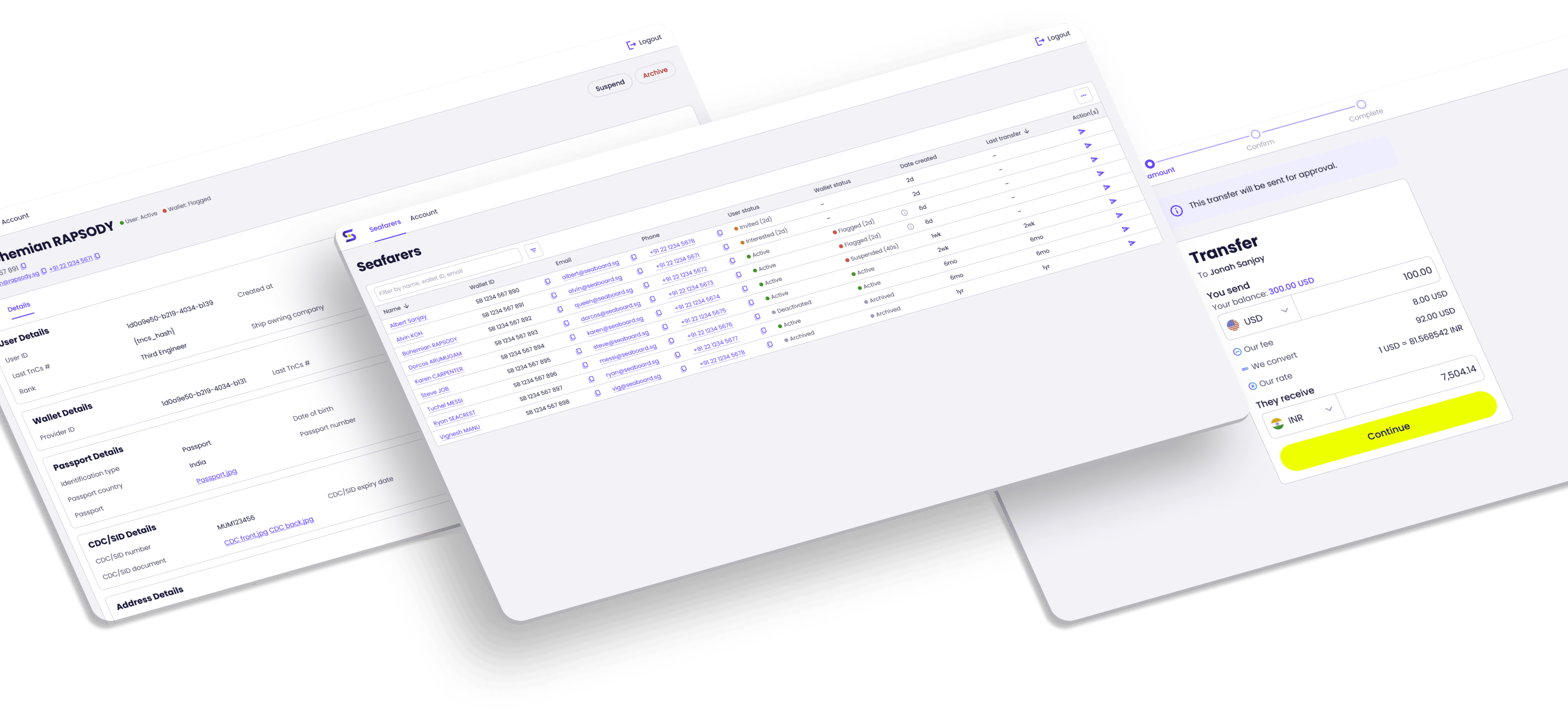
Company
Role
Responsibility
- Information architecture
- Interaction design
- Visual design
- Design system
Impact
Summary
Seaboard, a fintech startup, aimed to expand its user base. However, security risks, financial risks, and limited team resources hindered this growth.
To address these challenges, I help redesign the Back Office app, introducing role-based access for maritime organisations. This redesign aimed to improve security, reduce financial risks, and free up internal resources, ultimately targeting a 400% increase in user growth.
Background
Seaboard is an end-to-end crew wage platform providing 2 key products:
🖥️ Back Office (BO) App
A business client-facing product for maritime organisations to hold, manage organisation funds and disburse wages to their seafarers.
📱 Wallet Mobile App
A consumer-facing product for seafarers to receive wages and make transactions/payments via the app or debit card.
Here’s how it works:
- Maritime organizations deposit funds into their Back Office (BO) account.
- They transfer wages to seafarers.
- Seafarers receive and manage their wages via the Wallet mobile app.
Business Goal and Challenges
Our product and workflow have limitations that hinder our ability to scale and onboard more users:
🔒 Security Risk
Single login access to BO poses security risks, as anyone with access can view sensitive information and manage funds.
🏦 Financial Risk
Currently, we disburse wages on behalf of maritime companies. As our user base grows, the risk of errors increases with the rising number of wages managed.
🙋♂️ Limited Team Resources
As our user base grows, our current resources will eventually be insufficient to handle wage disbursements.
Project Goal
To overcome these limitations, the project goal is to expand BO with role-based access to onboard maritime organisation users to the platform. This resolves the obstacles by:
🛡️ Improving security
Only designated staff can access role-specific information and funds.
⬇️ Reduced risk
Maritime clients handle their own wage payments, reducing our liability as a company.
⚙️ Reduced operations overhead
By onboarding clients’ representatives to manage wage disbursements, we free up our internal resources.
Requirements Analysis
Understanding Requirements
I began the project by understanding the design requirements given by the Head of Product. The BO will expand from a single login to support multiple role logins:

Seafarers manager
Manage seafarers for organisations (e.g. adding, tracking, and archiving seafarers).

Wallet manager
Handles funds and wage payments for seafarers (e.g., topping up accounts, viewing transaction history, and disbursing wages in bulk).

Card manager
Our admin is in charge of distributing cards to seafarers (e.g., assigning cards, updating card status, and terminating cards).
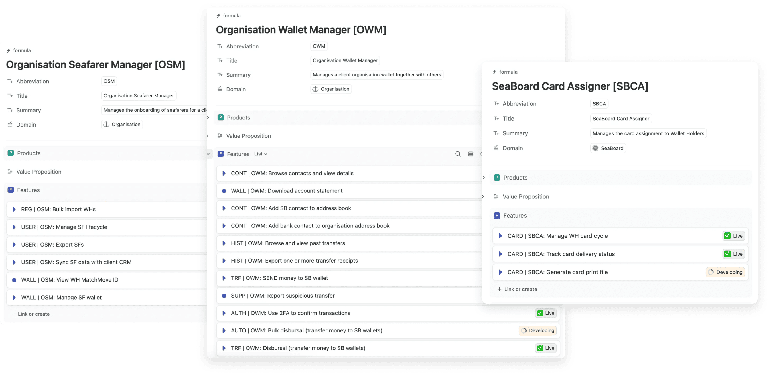
Defining Top Tasks and Feature Requirements
Together with the Head of Product and Product Manager, we had a working session to break down top tasks for each user role into product features, each supporting the task the user wants to do.
Information Architecture
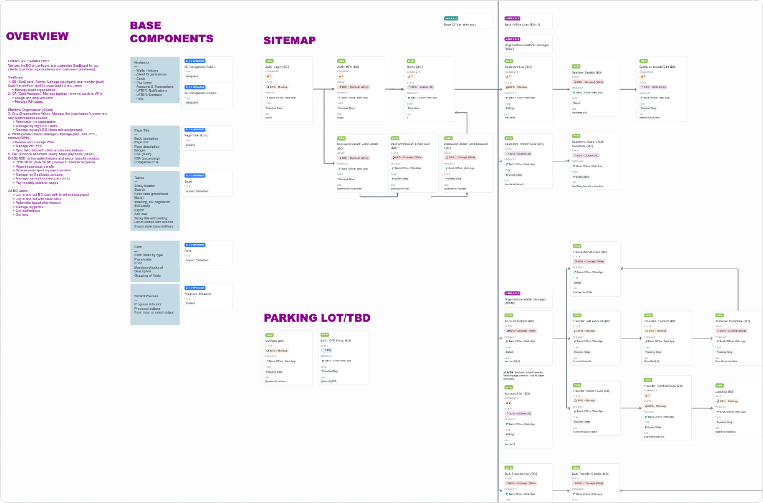
Sitemap
Next, I established the site structure by determining the necessary pages for each feature. Each page defines:
- Where users perform a step within a task flow.
- How users navigate to the next step to complete their task.
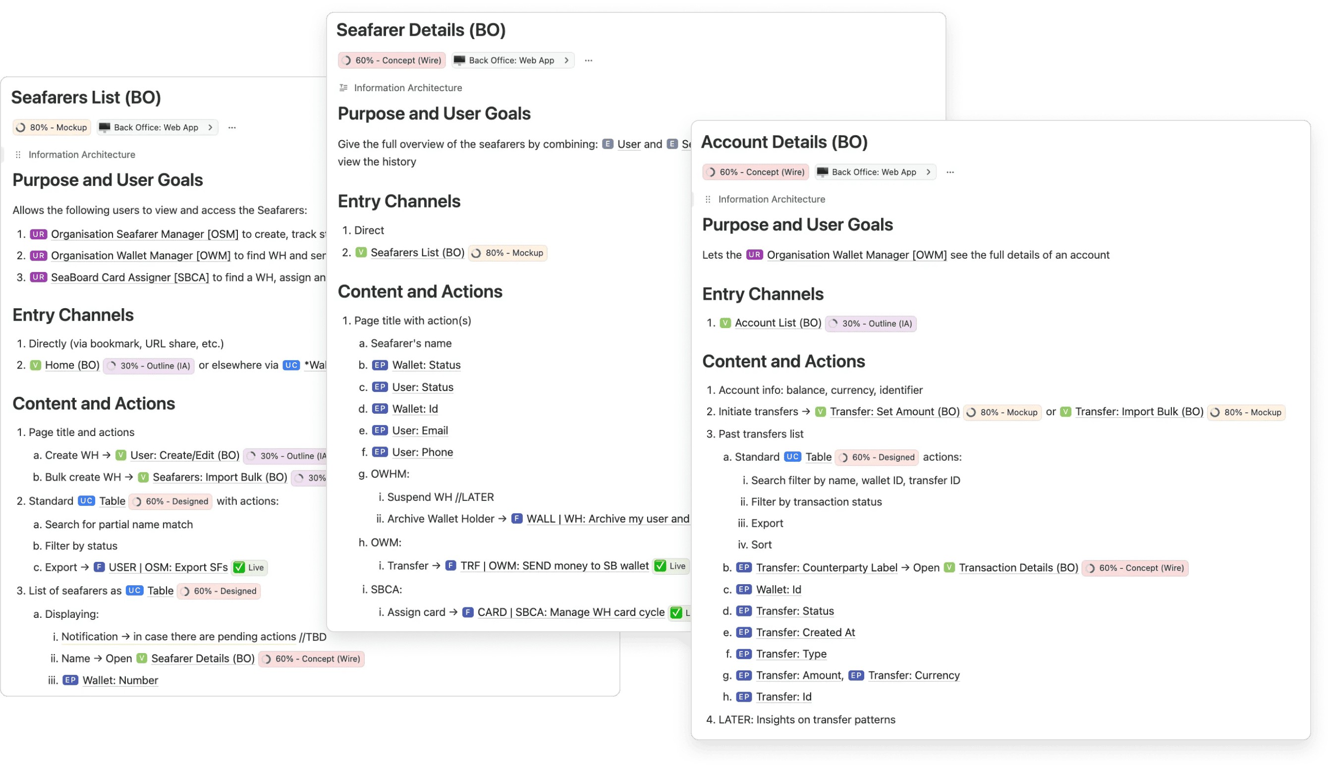
Core Model Definition
Once the pages were defined, I outlined the core model for each page. This includes thinking through the user and business goals on the page, how the user navigates to this page, and where to next; what is the information and structure on the page.
By knowing the information presented on the page, it also helps me identify the page templates and core components to build up the page.
UI Component Design: Table Example
Design Methodology
A methodological approach was used to define UI components, comprising:
- Requirements Definition: Identify component features and functions.
- Exploration: Explore potential solutions and ideas.
- Conceptualisation: Develop design concepts.
- Testing: Validating designs through design critique, or user testing.
- Refinement: Iterating and refining designs based on test results and new information.

Requirements Definition
Taking the table component as an example, I defined its requirements by drawing insights from the sitemap and core model. Key considerations included:
CONSIDERATION 1
What is the user trying to accomplish with the table?
- Finding records based on specific criteria (e.g., keywords or parameters)
- Taking actions on records (e.g., initiating a transfer)
CONSIDERATION 2
What are the essential components of the table required to support user actions?
- Browsing and navigating rows
- Retaining context while browsing up to 250,000 entries
- Handling up to 7 columns
- Table actions: Adding, importing rows in bulk, filtering, sorting, and exporting data
- Row actions: Opening details and managing a minimum number of row actions
- Supporting the display and layout of various data types: Strings, statuses, qualitative numbers, and quantitative numbers
Exploration
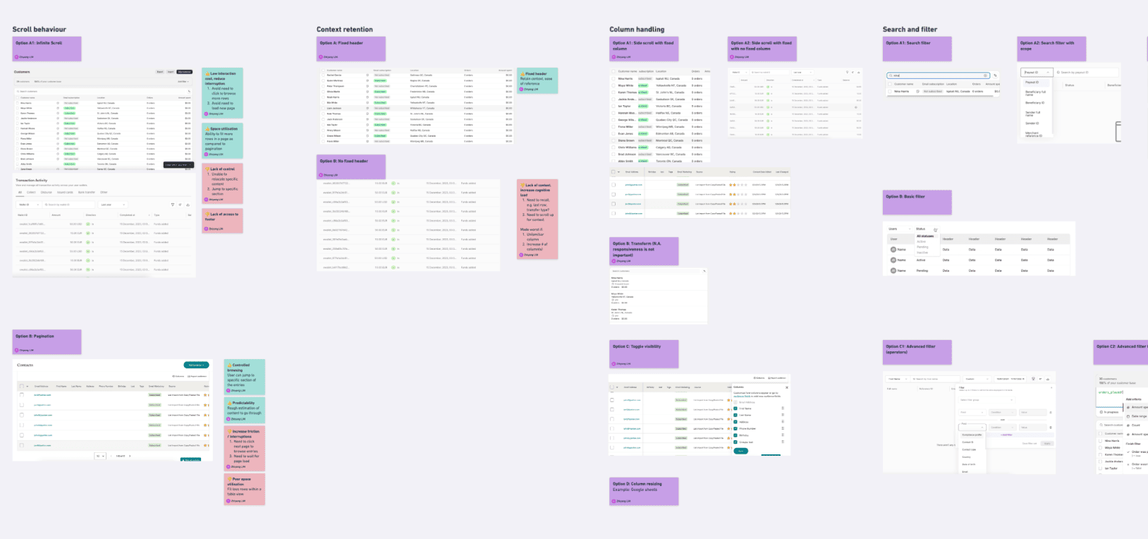
I researched similar product UIs and design systems to generate design options for each smaller part, addressing specific problems like filtering and handling large datasets.
Conceptualisation
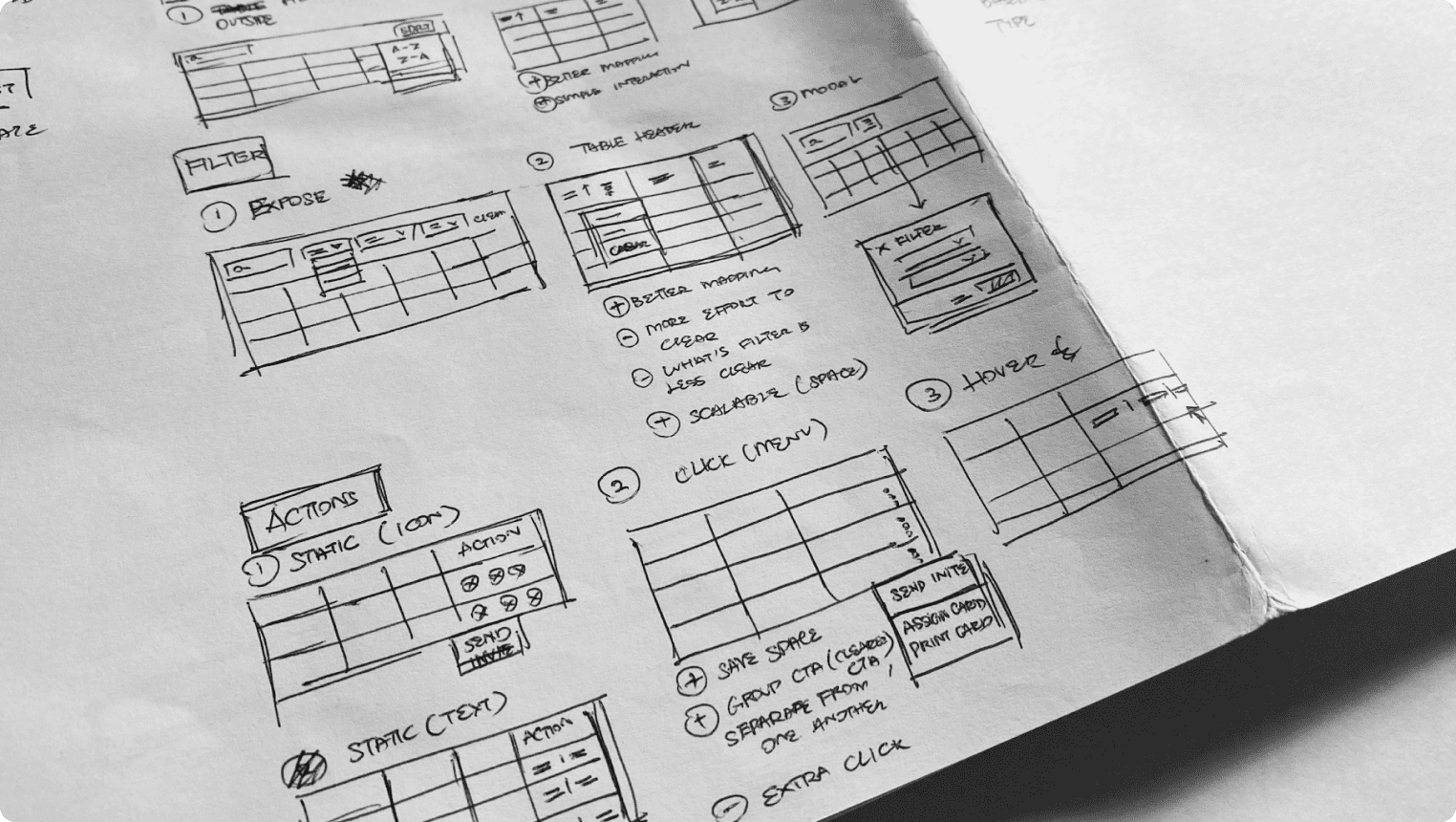
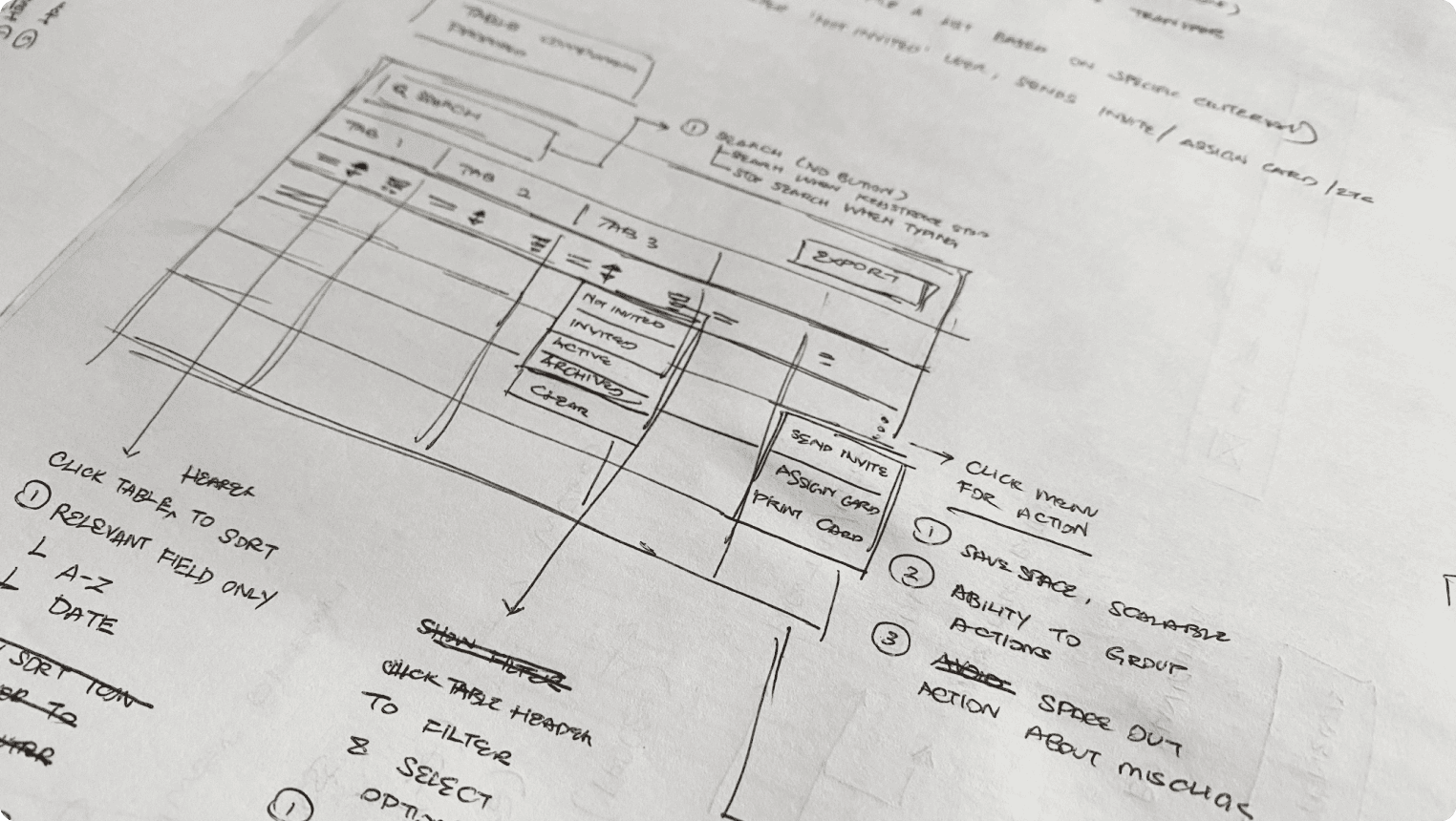
After collecting references, I created paper sketches to conceptually combine individual elements and form a cohesive table design.
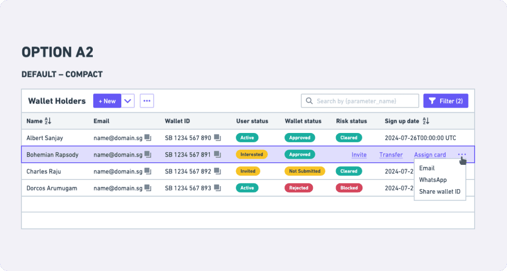
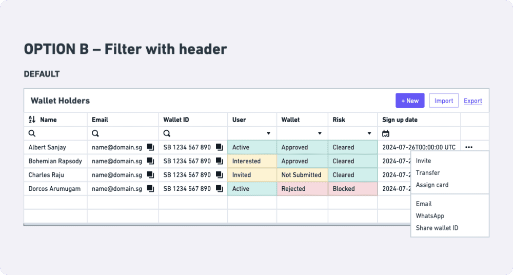
Testing
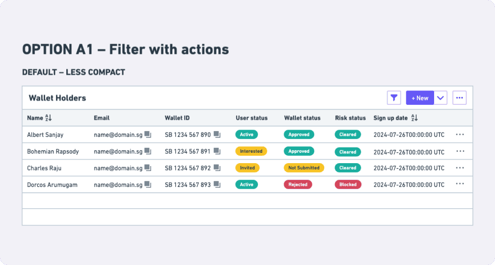
I drafted a wireframe design incorporating complex table scenarios and actual content to stress-test and validate the component concept with a few BO users.
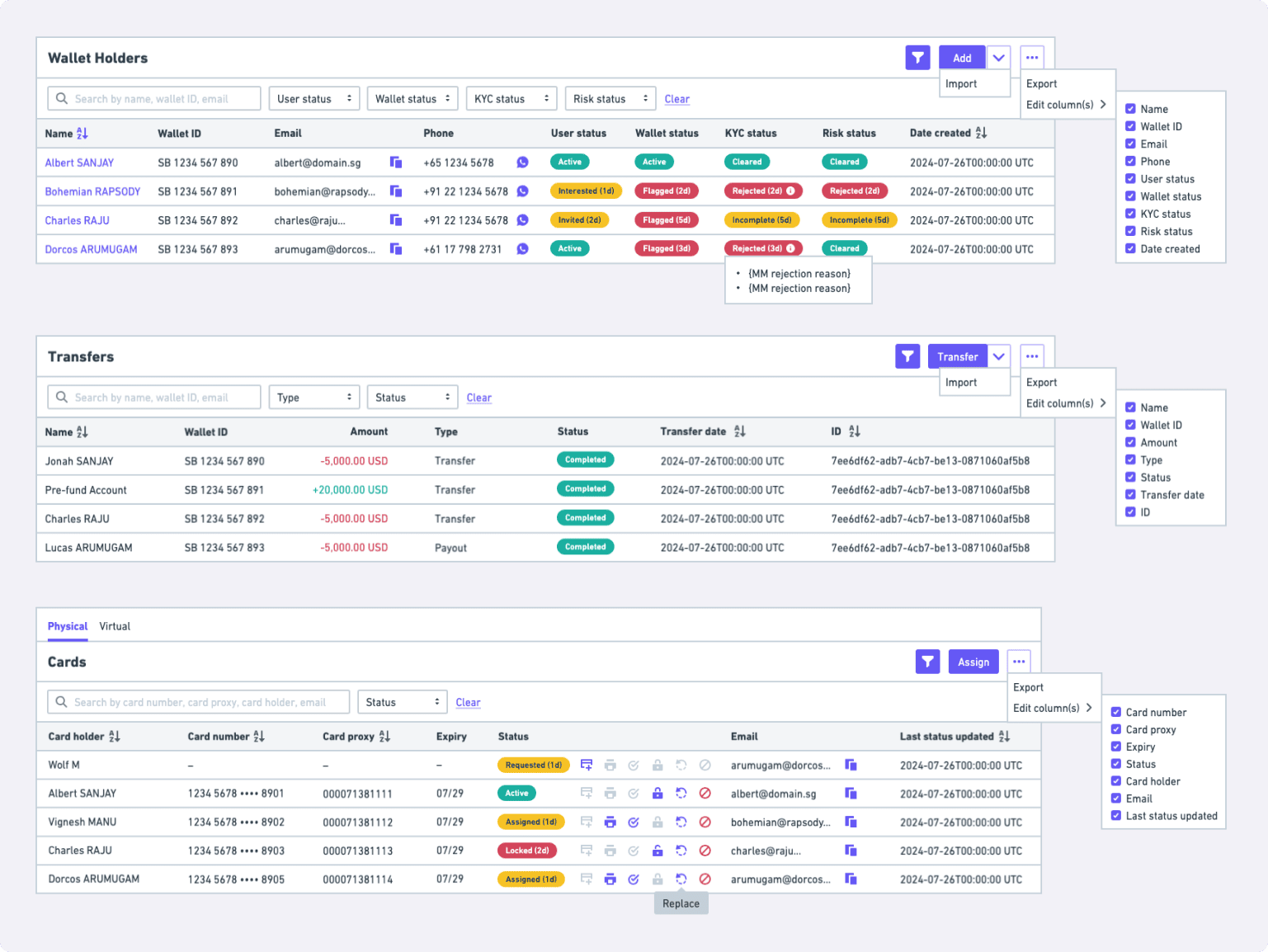
Refinement
Post-testing, I analysed feedback, identified major issues, and incorporated changes to improve the design:
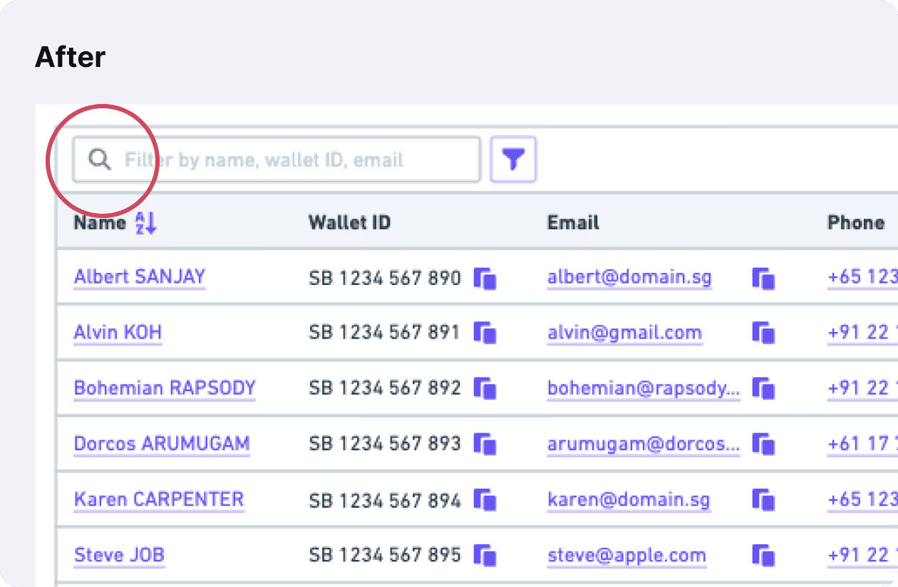
Hard-to-access filters
- Users commonly use search filters, filters were hidden, requiring additional clicks
- Changes: Exposed search filters
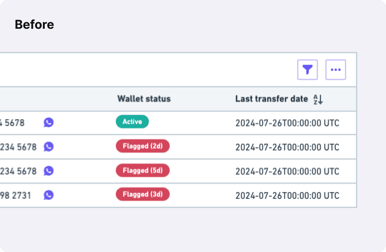
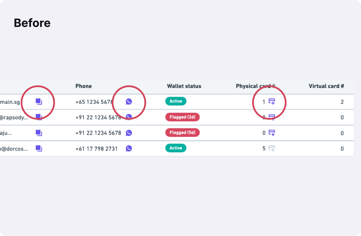
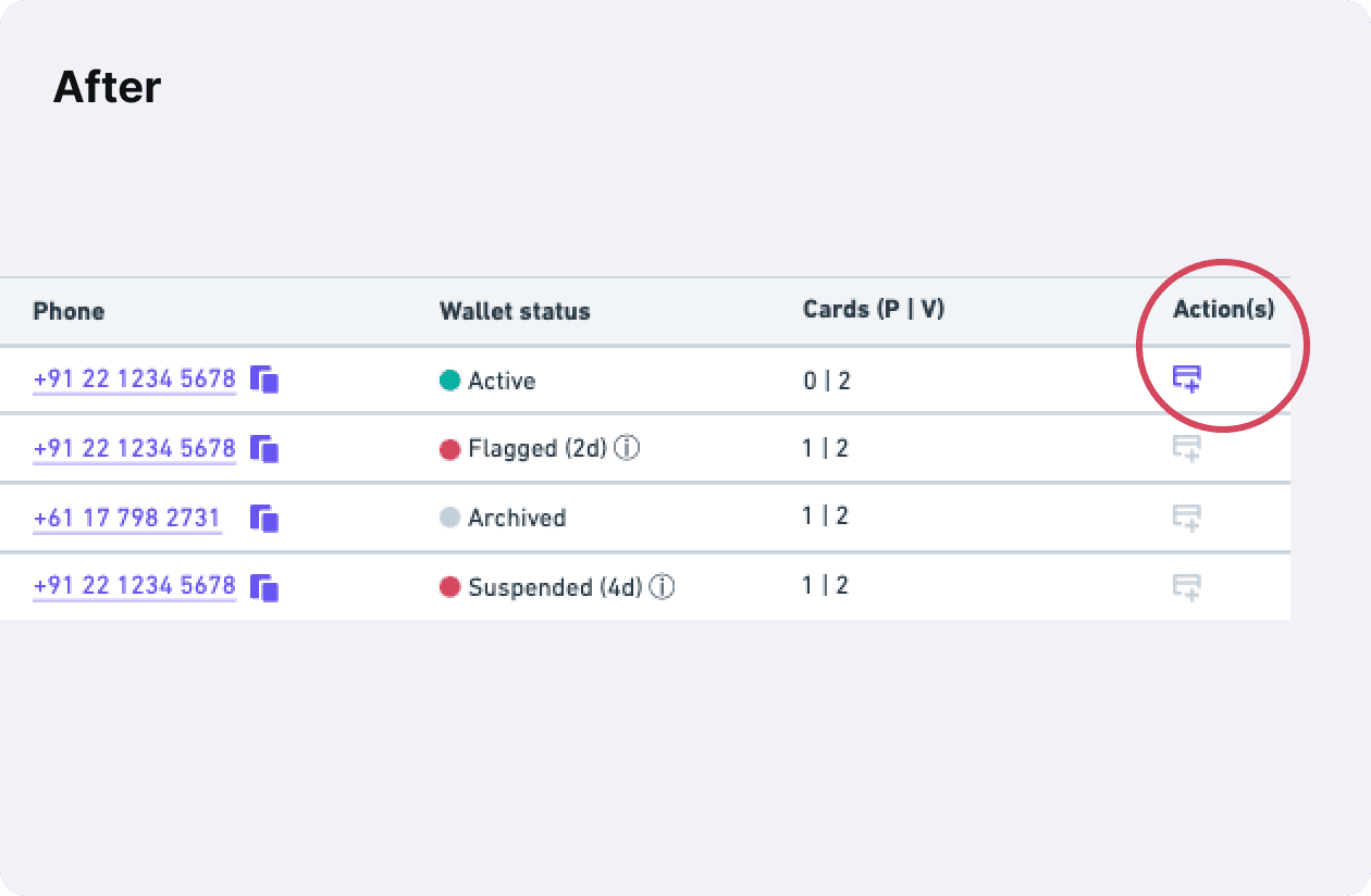
Unclear table actions
- Actions were scattered, making primary and secondary actions unclear
- Changes: Separated primary and secondary actions, making main actions clear by putting them in their own column
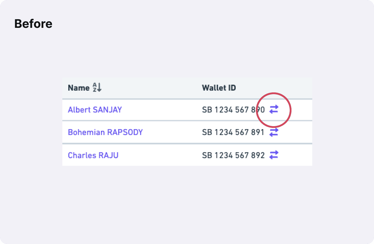
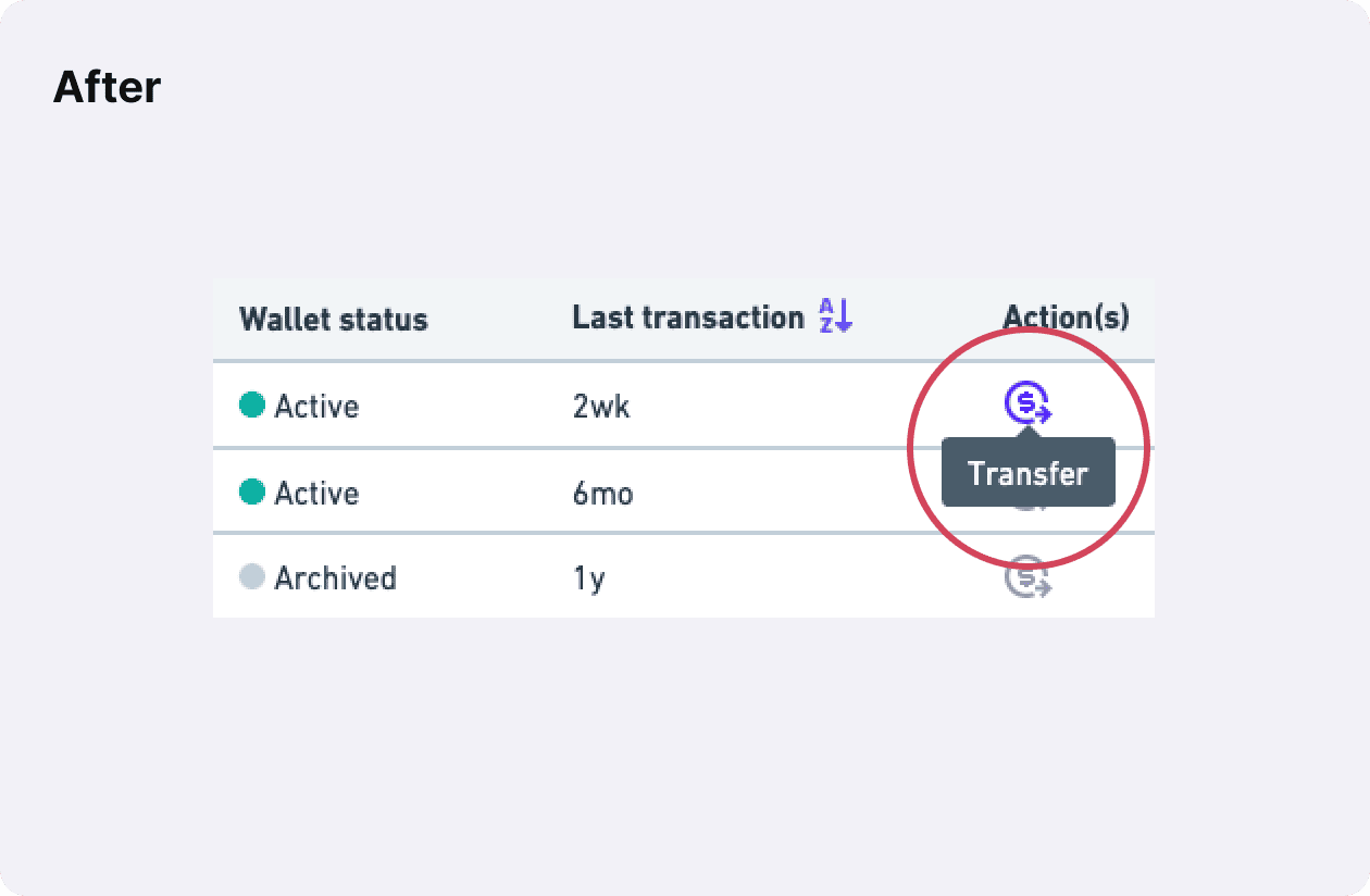
Unclear icon communication
- Some icons were unclear without labels (e.g., transfer)
- Changes: Show action labels on hover, use custom icons when necessary
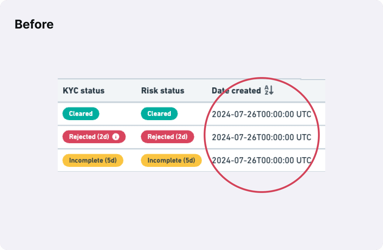
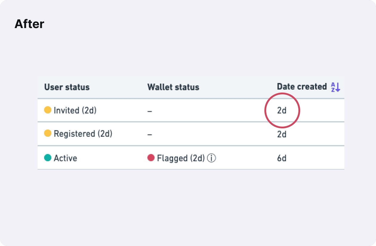
Relative date preference
- Users wants to see relative timestamps for immediacy to take decisive action
- Changes: Display relative dates on tables
Remaining Component Design
I applied the same iterative design process to define remaining core components, such as navigation systems and page templates, from abstract to detailed levels.
Back Office Design
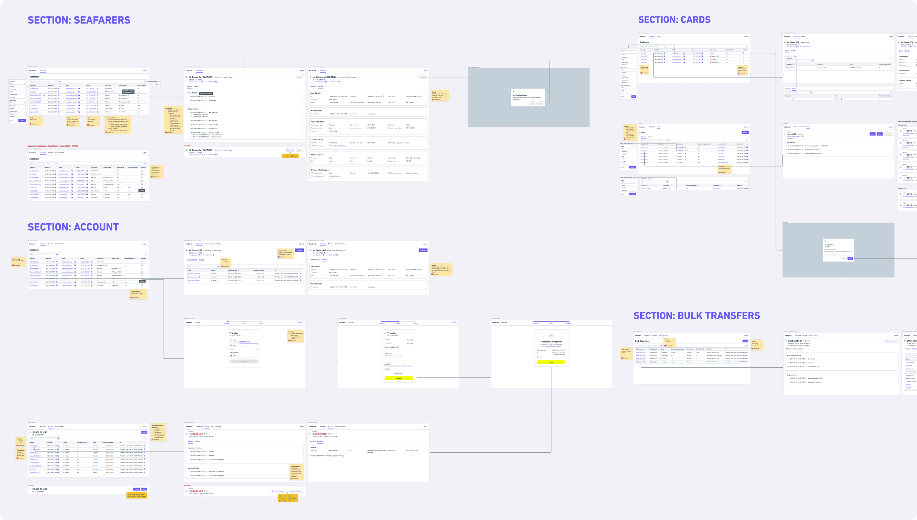
Wireframing
With core page templates and components defined, I drafted wireframes for each page, integrating components, content, and ensuring the overall concept is functional.
Visual Design
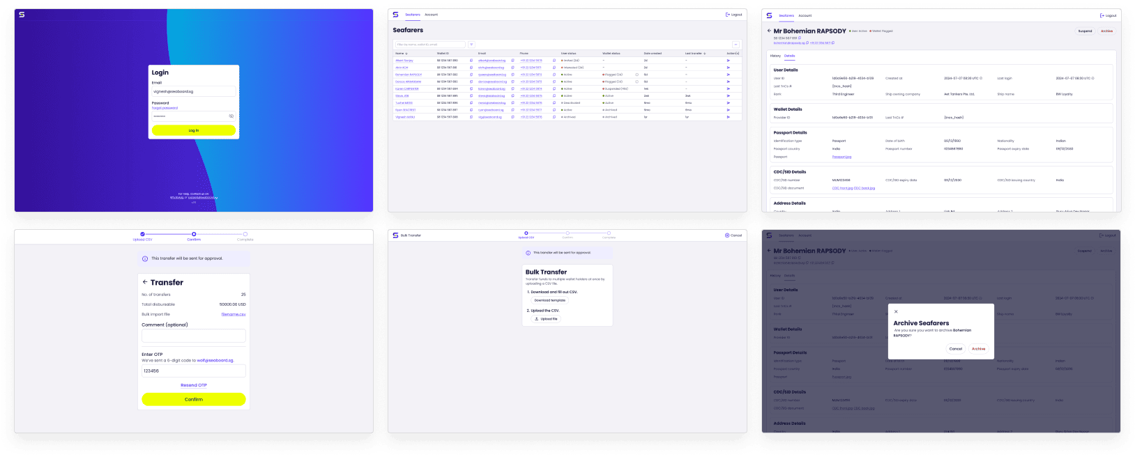
I added a visual design layer to templates and components, creating mock-ups for key pages to ensure cohesive UI design and provide a reference point for developers.
Documentation and Handover
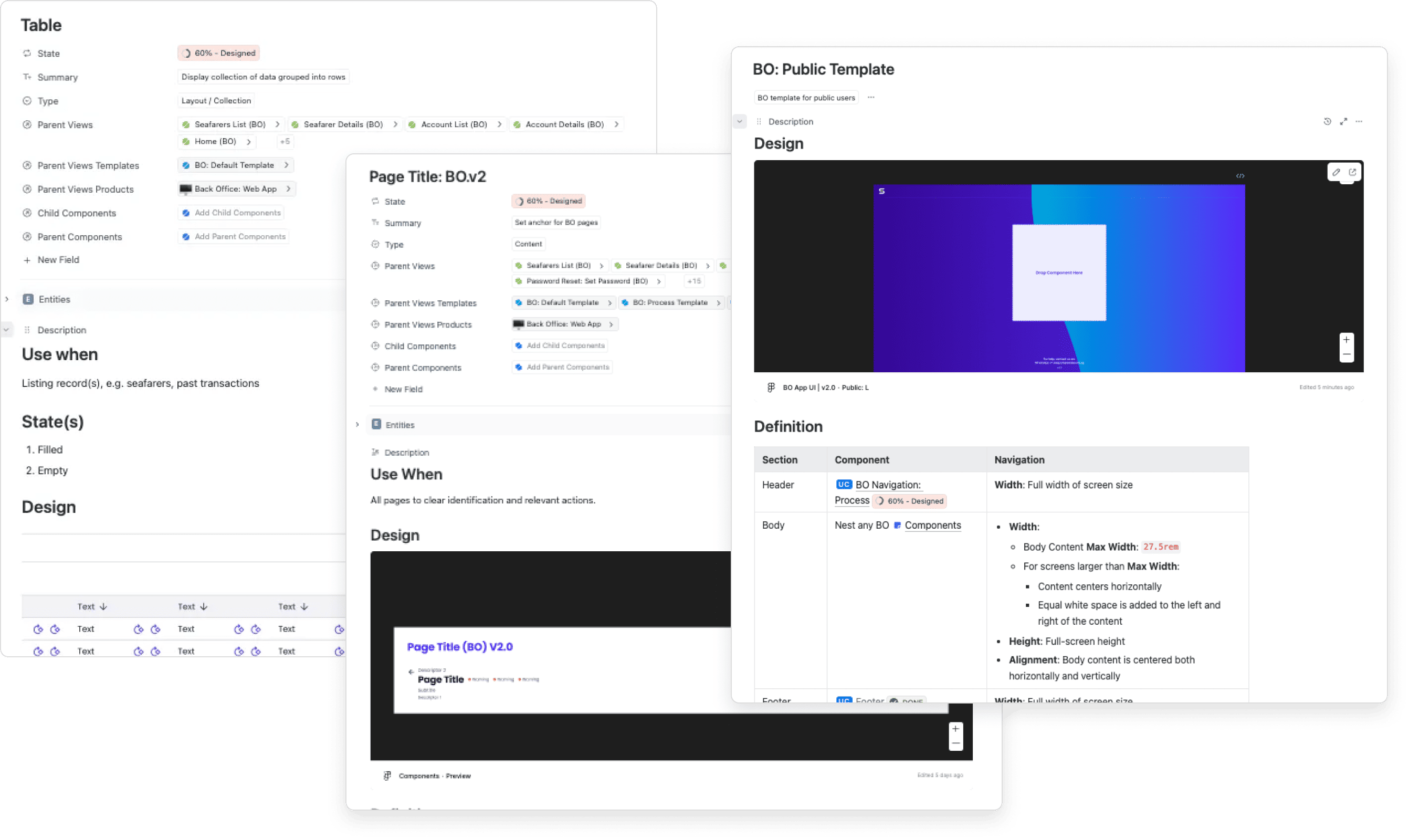
As part of the handover, I walked developers through the design and documented specifications for the UI framework and pages.
Impact
🚀 Potential increase in user growth by 400%
By addressing security risks, mis-transfers of funds, and resource limitations. For confidentiality reasons I have omitted the actual values for these metrics.
