Empower litigants in person to self-serve, leading to a substantial increase in the number of sessions, visitors, and engaged sessions.
SG Courts
Role
Interaction Designer
Responsibility
- UX Design
- UI Design
- Design System
Team
- Cherie Leck (Product Owner)
- Tay Qiao Wei (Content Strategist)
- Adam R. (Content Strategist)
Outcome
- No. of sessions up 65%
- No. of visitors up 56%
- Engaged sessions up 118%
Background
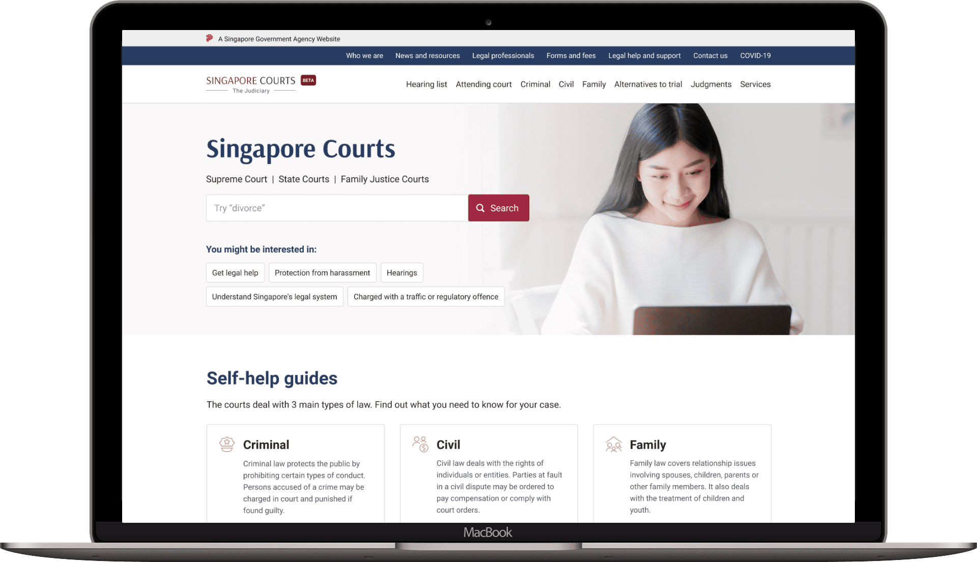
The Singapore Judiciary started an initiative to merge all of the courts’ portal: Supreme Court, State Courts, Family Justice Courts into a single portal, referred to as Singapore Courts, with the aim of making legal information more accessible to the public.
Currently, the courts receive a high volume of calls and email enquiries. The portal aims to help the litigant (a person involved in a lawsuit) to self-serve better, by making information accessible and easy to understand for a layperson, hence reducing their need to contact the courts.
Our Approach
Due to the complexity of the domain and the volume of the content, the team built the project iteratively in three launches – first launch (civil matters), second launch (criminal matters), and final launch (family matters and other non-legal sections).
For each launch, the team went through the discover, define, design and build phases. Throughout the project, we collaborated closely with the domain knowledge experts and the Judiciary team.
Research
The team conducted a series of interviews with frontline officers and pro-bono lawyers to understand the main challenges encountered by an unrepresented litigant. We also conducted secondary research and site audits in parallel, to connect the dots between various data points.
PROBLEM 1
Uninformed litigants
We discovered that most of the litigants are highly unaware and uninformed. They are often not aware of court processes and the consequences of their actions and decisions. They are oblivious of where they stand in the process and where to start. This results in the feeling of not being in control of their situation.
LIPs are very clueless of the overall sentencing process and do not know what to expect. They don’t even know the appropriate questions to ask.
– Staff from Community Justice Centre
PROBLEM 2
Challenges in information seeking
Our research also revealed that litigants often default to seeking in-person assistance from a court officer. Most of them did not trust the website as the information feels incomplete, they felt more assured when communicating with a court officer.
Our design and content audit also revealed that the court websites are not well-optimized for mobile and are full of legalese. The information architecture is also poorly defined, and as a result users often cannot find what they need.
Currently the content is all there, but the way it’s being conveyed doesn’t work, people don’t understand it.
– Staff from The Law Society of Singapore
Furthermore, there are a myriad of resources and viewpoints that are available on the net, making it even more challenging to find the right information.
PROBLEM 3
Stress management
Most of the litigants experienced high levels of stress and anxiety as they went through the court process. due to a broken court experience and the consumption of long legal information.
Framing the Problem
How might we?
Together with the client team, we discussed the findings and utilised a 2×2 matrix to help frame the issues, forming a how might we statement:
How might we make it easy for public court users to access our website so that they have accurate and complete information to make decisions, taking into account that the judiciary can only provide legal knowledge but not advice?
Defining design principles
The team also jointly defined 6 design principles. These principles serve as guidelines towards making the right decisions and keeping the product vision in focus.
- User first, not court first
- One experience, not three experience
- Empower, not overwhelm
- Give answers, not information
- Be clear and familiar, not complex
- Provide context, not just details
The Design Process
Defining visual direction
One of the challenges of this project is to align the visual style for all 3 courts. Based on the existing brand guides, I developed 3 stylescapes based on the brand attributes to align the visual direction with the stakeholders.
Stylescapes is a design tool that expresses and steers the visual language for a project which allows stakeholders to visualise a brand before going into the actual design. It saves time and avoids wasteful design revisions.


Content first
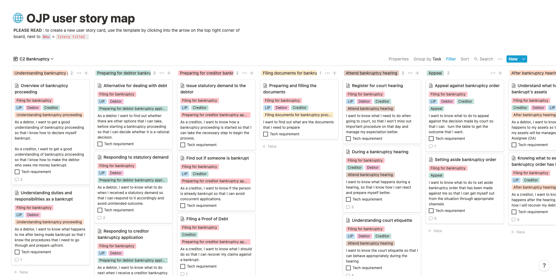
Before getting into high-fidelity mockups, the team spent quite some time understanding the legal system, mapping out various court processes and translating them into user stories.
The user story maps ease the process to identify gaps and formulate product backlog, which allows us to break down a large user story into actionable tasks, all while keeping user needs in mind. The new content and site structure is created based on the process map.
Developing interaction framework
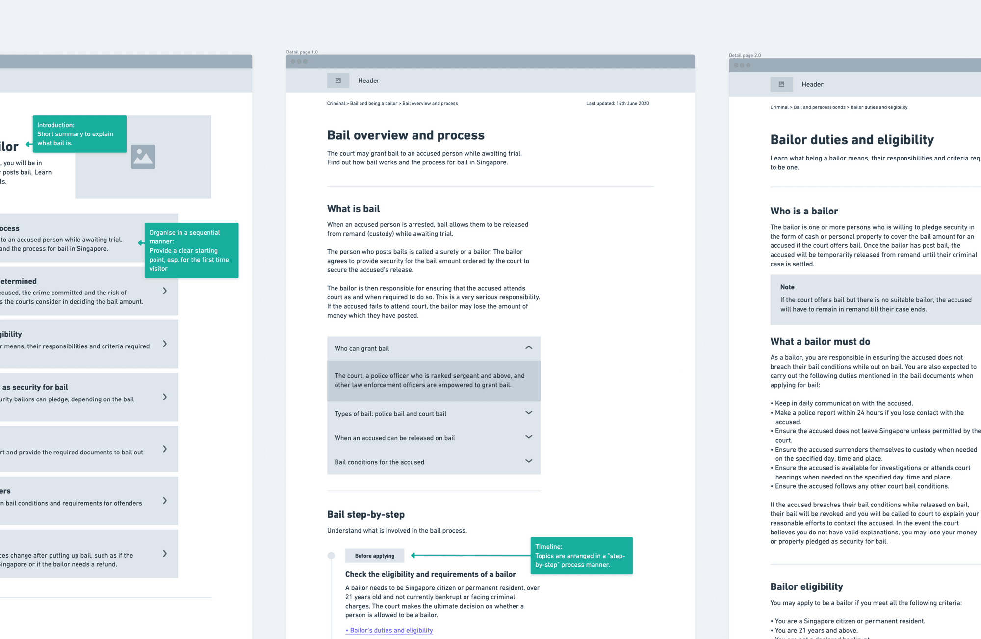
During this stage, I defined the user flow, brainstormed and explored multiple design concepts.
The interaction framework went through multiple iterations as I gathered feedback from the team and stakeholders. It continued to evolve throughout the project as we went through rounds of usability tests and product launches to cater to new-found scenarios and users needs.
Prototyping and usability testing
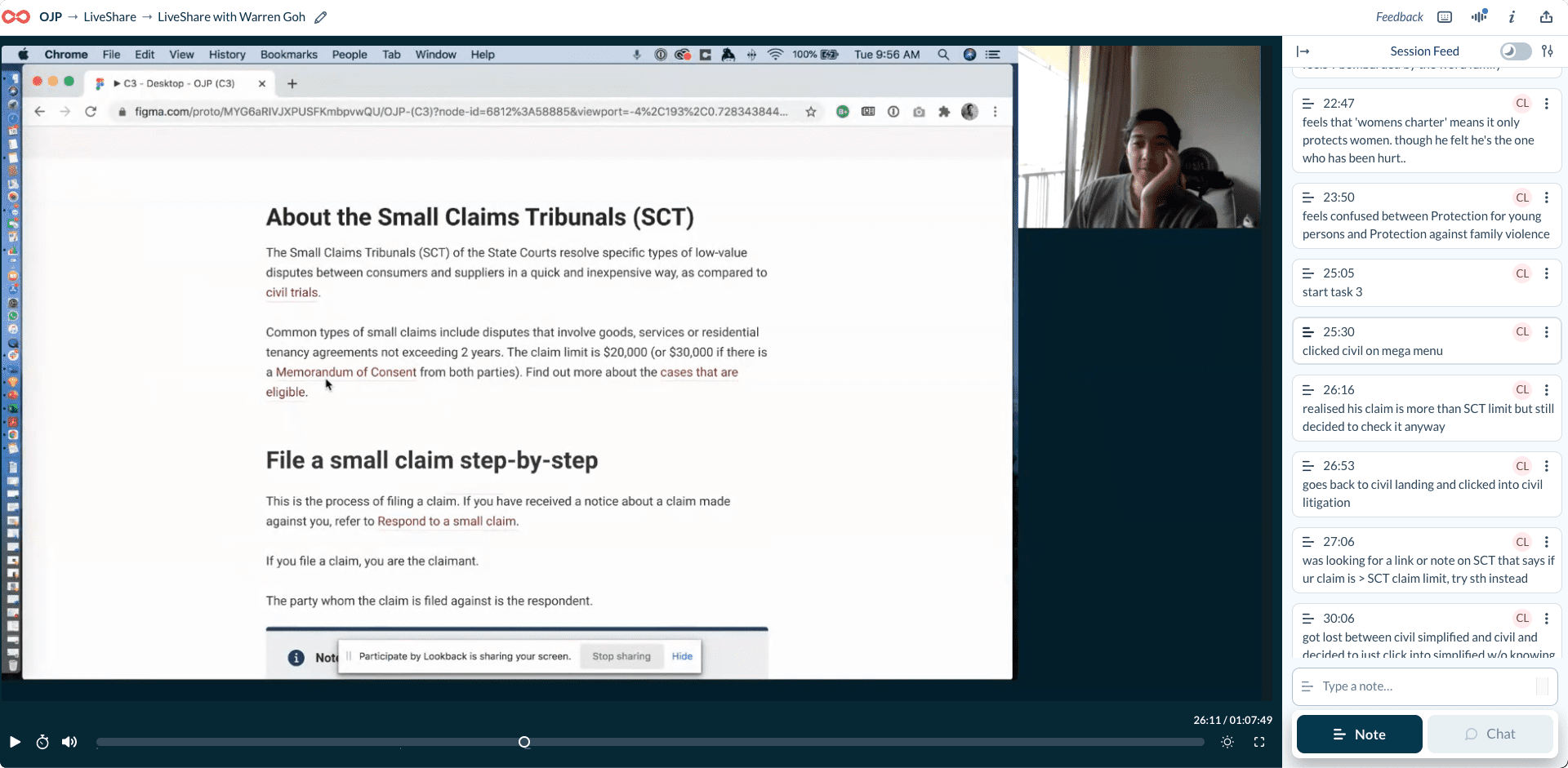
To move forward with the design, I translated the interaction framework into a functional prototype, while integrating the visual direction that had been set earlier in the process. We conducted usability tests with the users to identify usability and content issues and improved the design progressively.
The Design Solutions
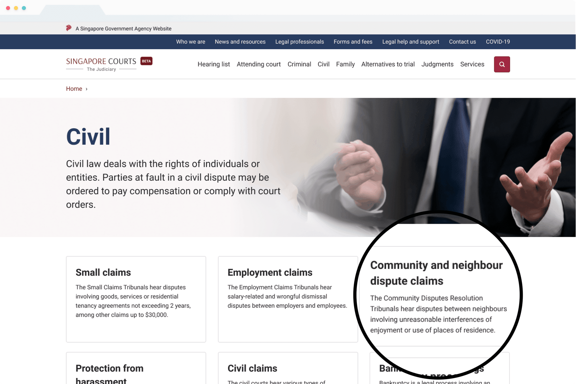
Organise around tasks
Currently, the majority of content is structured based on the individual courts. Users have to know where it needs to be done (which court), what needs to be done and finally how it needs to be done. The team reorganised the site architecture from courts-based access to task-based access.
Providing guidance and assurance
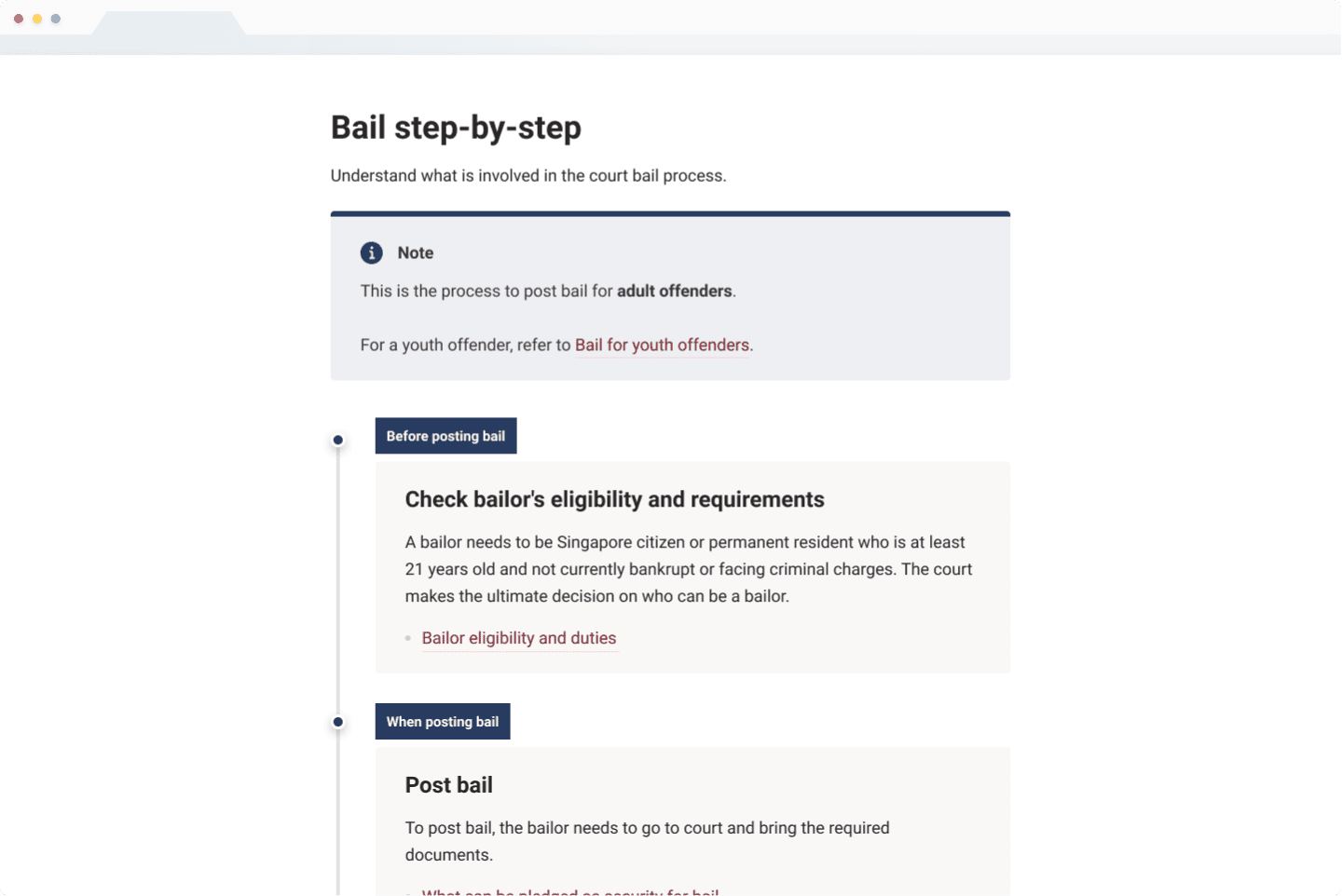
Step-by-step navigation
On every main topic page, a step-by-step navigation pattern presents a certain courts/legal process from the start to end, with links to informational pages to help users complete each step. The step-by-step guide provides a brief overview of the process and clear steps for users to follow. Laying out all of the steps, improves user confidence by eliminating the fear of missing out on any critical information.
The step-by-step guide is also presented on the detail page as local navigation, indicating where the users are currently at as they learn about a court process.
Interactive flowchart
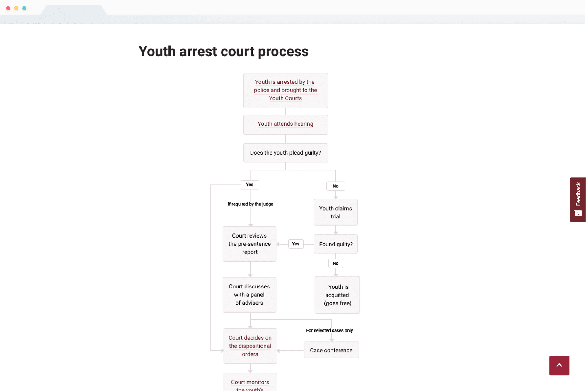
A number of court processes are non-linear and complex in nature. An interactive flowchart facilitates better understanding of the court processes and the possible outcomes such that users can manage their expectations accordingly. The litigant would be more aware of the implications of their decisions at different junctures as they go through a court proceeding.
Making legal information understandable
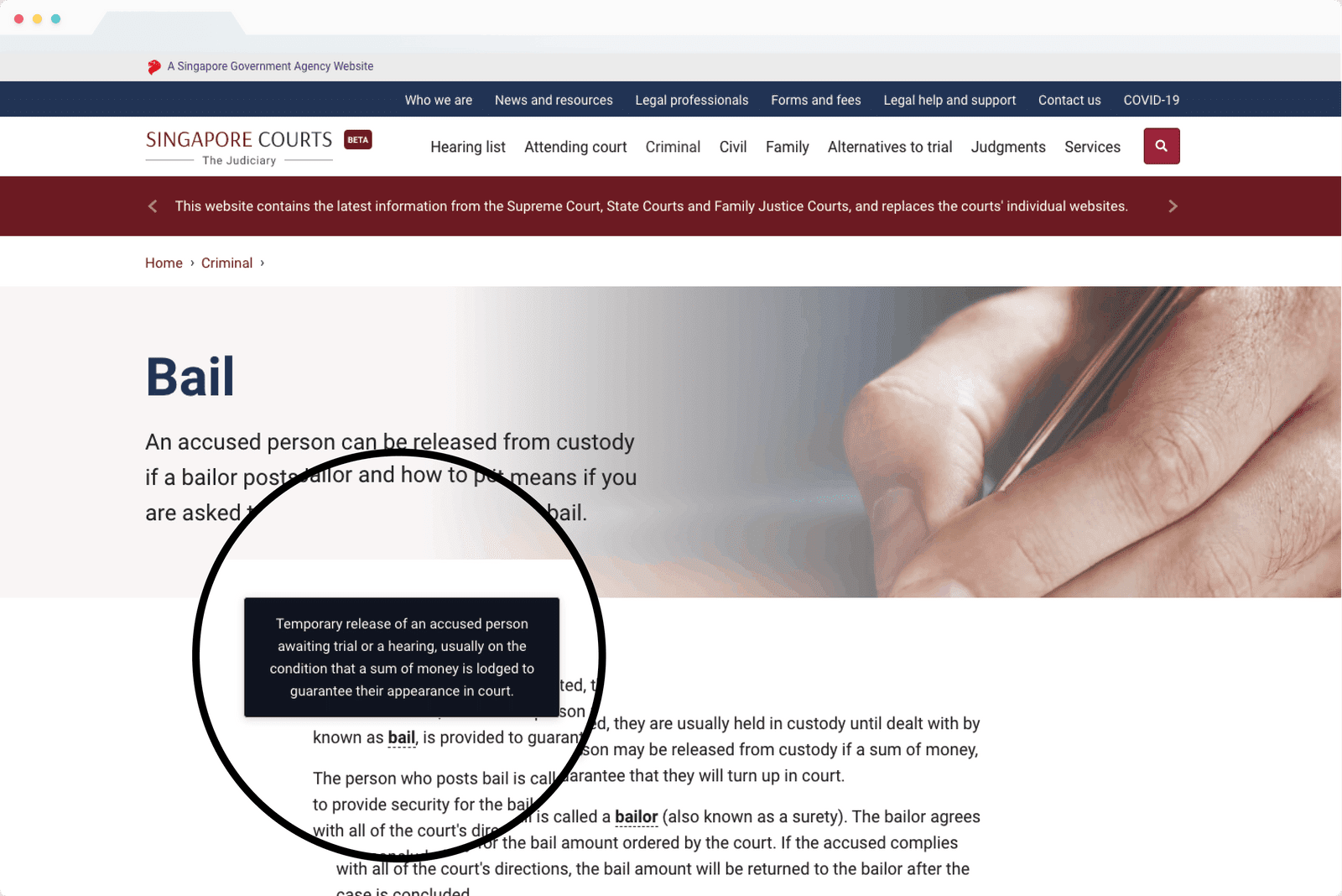
The 'glossariser'
The team rewrote the content in plain language for easier understanding of the court process and legal jargons. “Glossariser” component is introduced to explain legal terms or context.
Making information digestible
Guide pages
A court process can be long and complex. Guide pages break down the content into multiple pages to enhance the information consumption experience, as based on our research, users gave up reading the information on the site as it was too overwhelming and intimidating to go through.
Our solution was to present next and previous links at the end of a guide page to provide the next step for the users as they navigate through the site, giving them a sense of control.

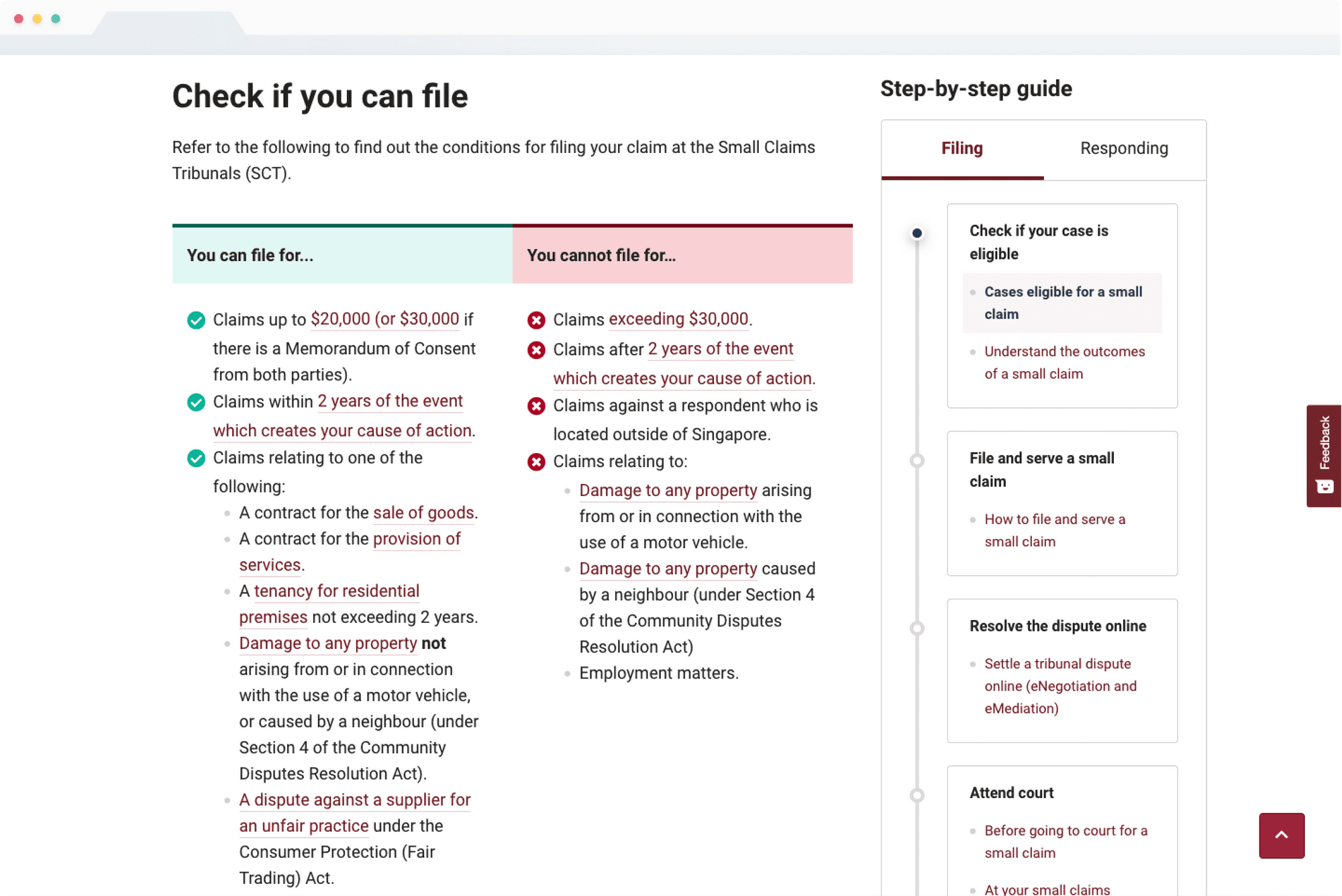
Comparison table
A comparison table is introduced for users to determine if a legal proceeding is suitable for them, and whether they meet the requirements upfront. This allows users to decide if a topic or a page is relevant for them before proceeding to learn more about a topic.
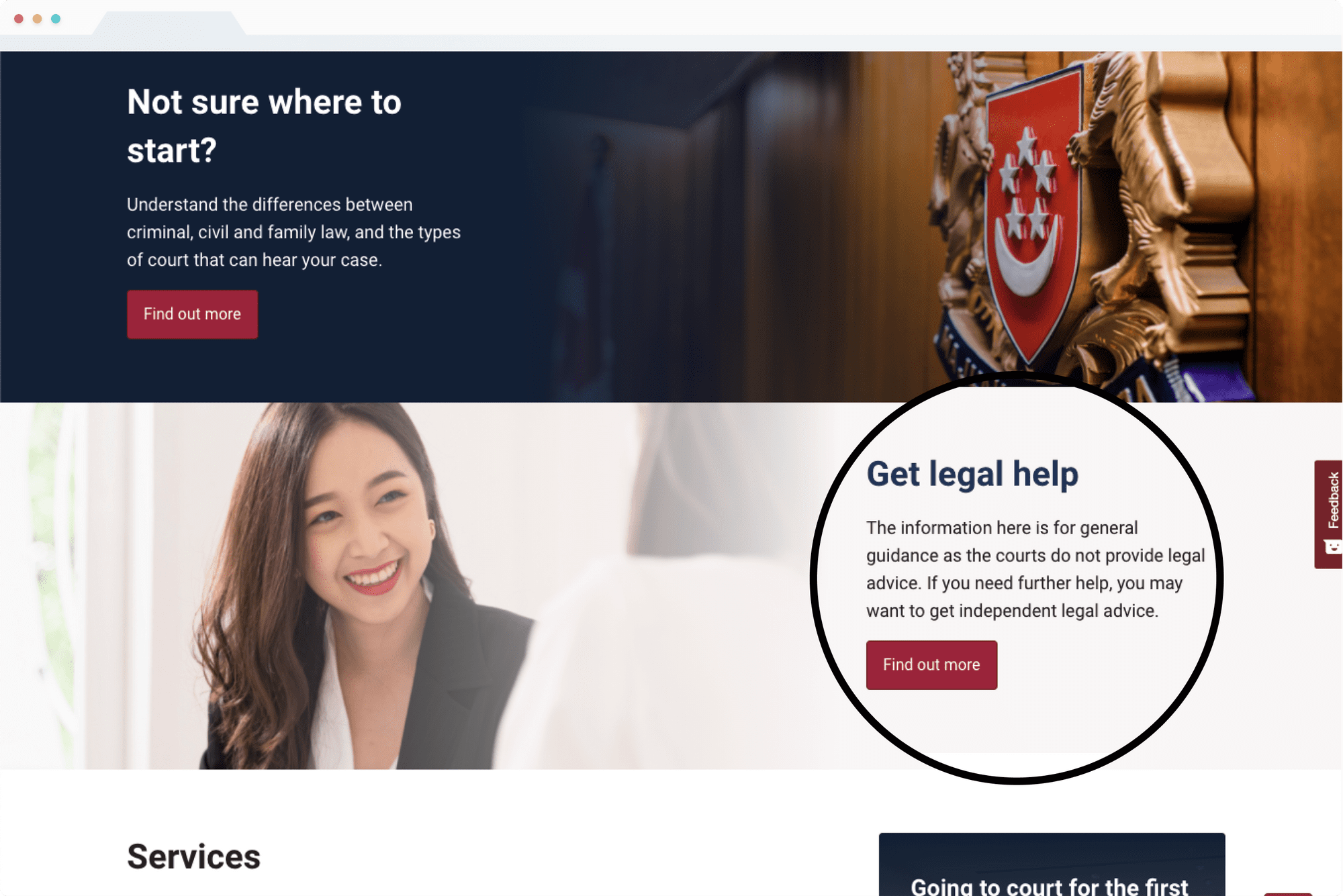
Increasing the awareness of legal aid and pro bono services
Our research revealed that most users were unaware that they have legal aid available. Hence, we surfaced the information upfront on the homepage to improve visibility.
Besides, the mention of legal aid is also available at the end of the content page. Wherever the users feel stuck or lost, an option is provided for the users, directing them to get additional help and support.
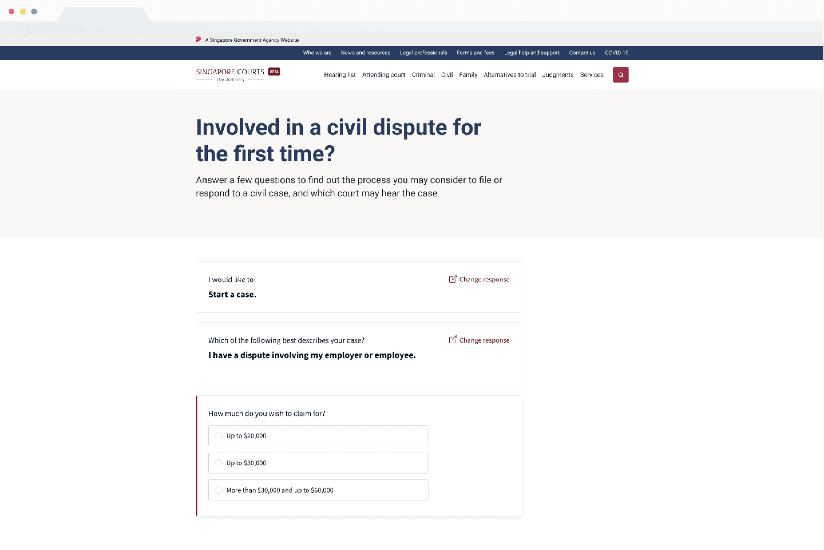
Guided answer (unused idea)
The team has also explored using the guided answer pattern, which allows users to identify relevant legal proceedings by presenting tailored answers based on their inputs. The design solution received positive feedback from the users.
However, the solution was not implemented as the Judiciary team was not comfortable with the approach, as it may seem that the court is providing legal advice to the public, as legally, the court has to remain an impartial party.
The Impact
The beta site was officially launched in February 2021, and the subsequent version was launched in early April 2021. To date (June 2021), the number of visitors and user engagement has grown substantially since the second launch:
No. of sessions increased by
65%
No. of visitors grown by
56%
Engaged sessions increased by
118%
